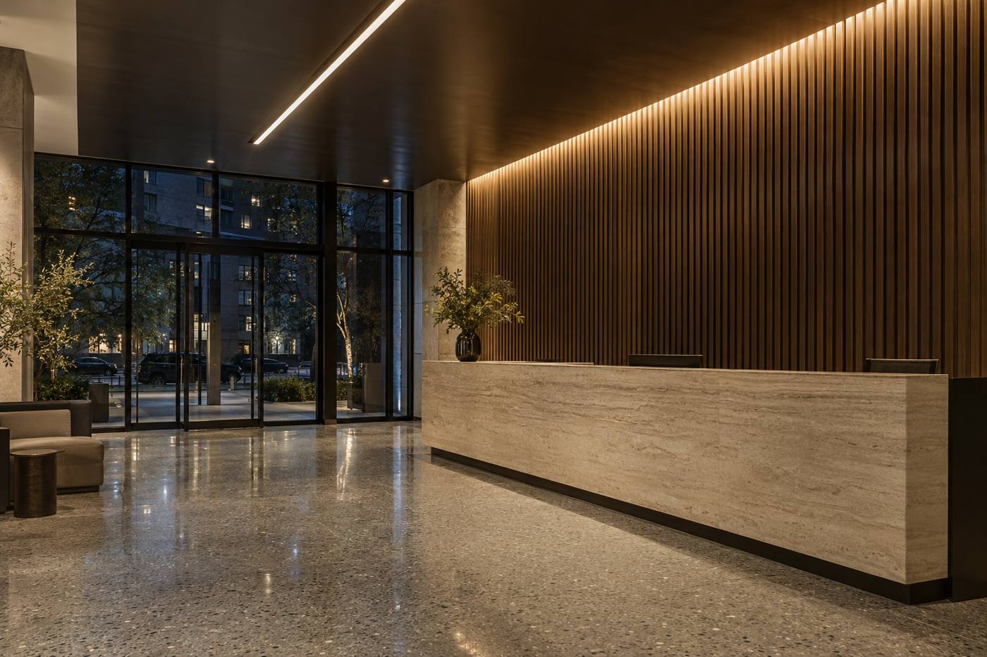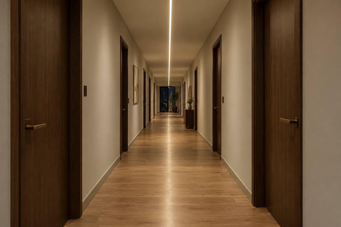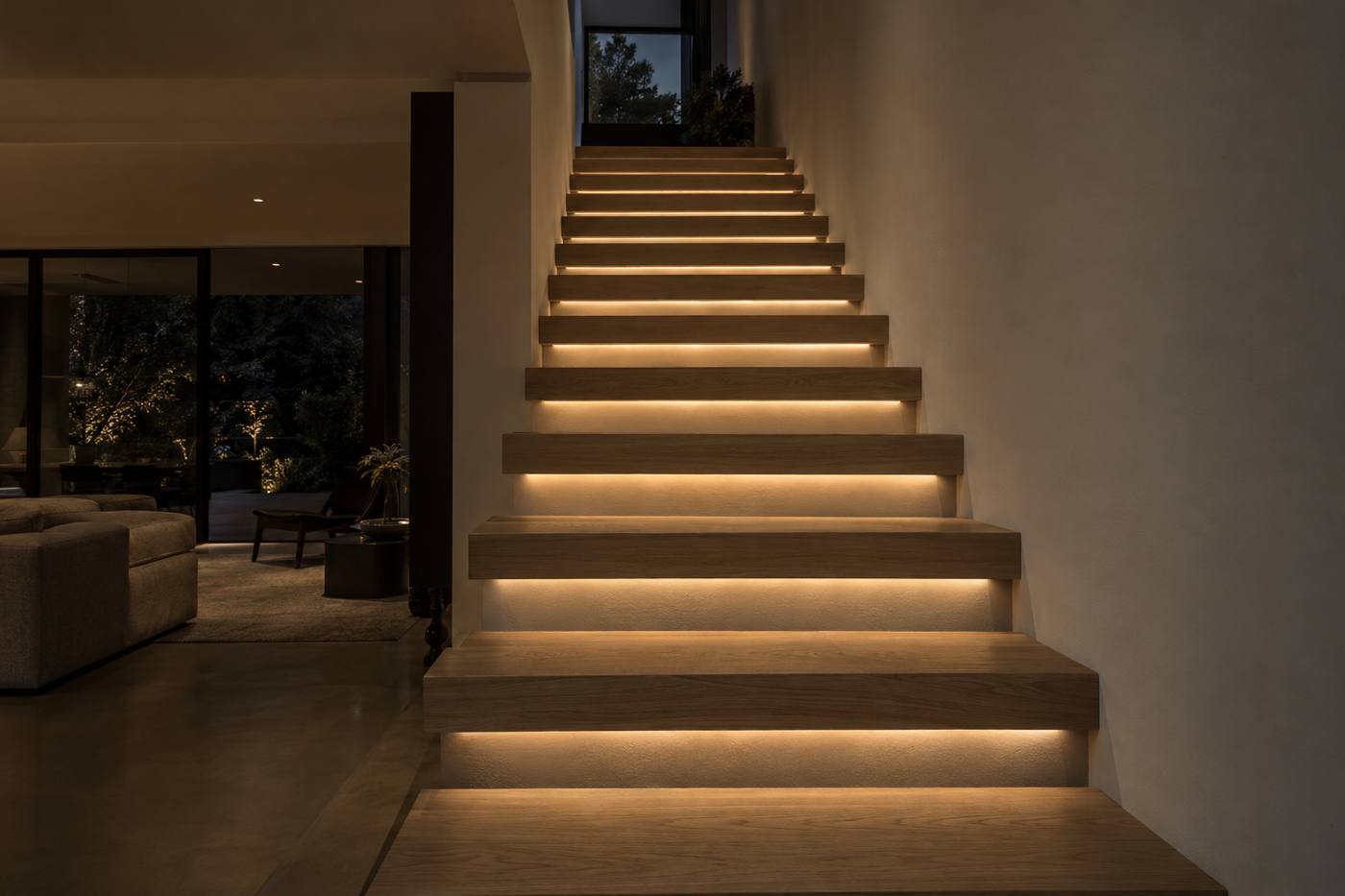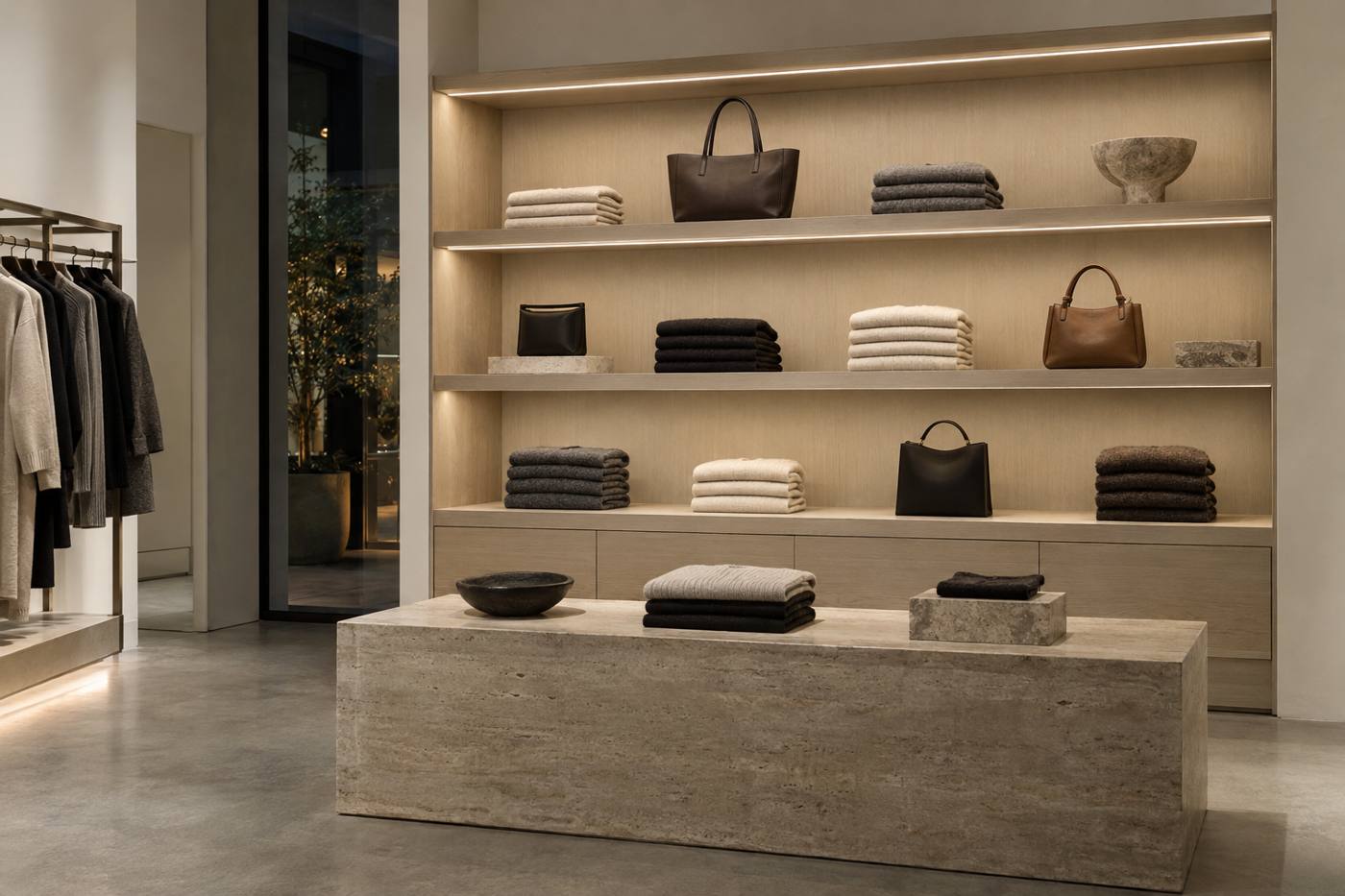
Two strips can share the same color temperature and the same lumen output and still make a room look completely different. One renders walnut as rich and warm, skin as healthy, and a red sofa as red. The other flattens everything into a slightly gray, slightly green version of itself. The difference is color rendering, and it is one of the clearest dividing lines between commodity tape and spec-grade linear light.
What CRI actually measures
The Color Rendering Index (CRI, reported as Ra) compares how a light source renders a set of test colors against a reference source of the same color temperature. A perfect match scores 100. The general index Ra is the average of the first eight test colors, labeled R1 through R8, which are all fairly muted, pastel hues.
That averaging is both CRI's strength and its weakness. It is simple, universal and easy to put on a spec sheet. But a source can score well on eight soft pastels while doing a poor job on saturated colors, which is exactly what people notice first in a real space.
Why 90+ is the spec-grade baseline
For architectural interiors, 80 CRI is generally considered the minimum acceptable and 90+ is the expectation for spaces where materials and people are on display. Every FlowLite tape is built to 90+ CRI as standard. That is why FlowLite part numbers carry a 9 in front of the color temperature: FL-TCOB30-24-930 means 90+ CRI at 3000K.
| CRI (Ra) | Typical result | Where it fits |
|---|---|---|
| Below 80 | Visibly flat, desaturated color | Utility and back-of-house only |
| 80–89 | Acceptable for general tasks | Storage, service corridors, budget work |
| 90–94 | Natural skin tones, wood and finishes | Residential, multifamily, hospitality, offices |
| 95+ | Very high fidelity | Galleries, high-end retail, color-critical work |
TM-30: a fuller picture
ANSI/IES TM-30 was developed to address CRI's limits. Instead of eight samples, it evaluates 99 color samples drawn from real objects, and it reports two headline numbers rather than one:
- Rf (fidelity), from 0 to 100: how closely colors match the reference source on average. It plays the role CRI was meant to play, with a much broader sample set.
- Rg (gamut), centered on 100: whether colors are, on average, more saturated (above 100) or less saturated (below 100) than under the reference.
TM-30 also produces a color vector graphic, a circular plot showing which hues are pushed toward more saturation and which are pulled toward less. It lets you see, for example, that a source makes reds slightly more vivid while making greens slightly duller. Two sources with identical Rf can look different, and the graphic shows why.
How to use the numbers in practice
Set a floor
Specify 90+ CRI as a minimum for occupied interiors, with a stated minimum R9 where red rendering matters.
Ask for TM-30 on critical jobs
For retail, hospitality and galleries, request the TM-30 report (Rf, Rg and the vector graphic) so you can compare sources on the same basis.
Mock it up
Numbers narrow the field; a mock-up against the real finishes makes the decision. Look at the stone, the millwork and the paint under the actual tape, in the actual channel.
Keep it consistent
Use the same tape and the same CRI throughout a space. Mixing an 80 CRI under-cabinet with 90+ cove lighting is noticeable on the same surface.
Key takeaways
- Ra is an average of eight pastel colors; it can hide poor saturated-color performance.
- Check R9 for skin, wood and food.
- TM-30 adds fidelity (Rf), gamut (Rg) and a vector graphic showing hue shifts.
- FlowLite tape is 90+ CRI as standard; the 9 in the CCT code (927, 930, 935, 940) says so.